Framing Panoramic Views of Portland, Oregon
“Marlys was able to get to the essence of what I’m asking for and transform that into the fabrics and textures . . . the airiness of the fabrics – it keeps our house looking bright and fresh all year long.”
Framing Panoramic Views of Portland
How Do You Frame a Beautiful View without Losing It?
Many of our clients feel conflicted about how to treat windows with incredible views. Homeowners search far and wide for properties with special, often meaningful views, and they want to enjoy them. At the same time, they don’t want to leave their walls bare and loose the opportunity to define a space with a beautiful design.
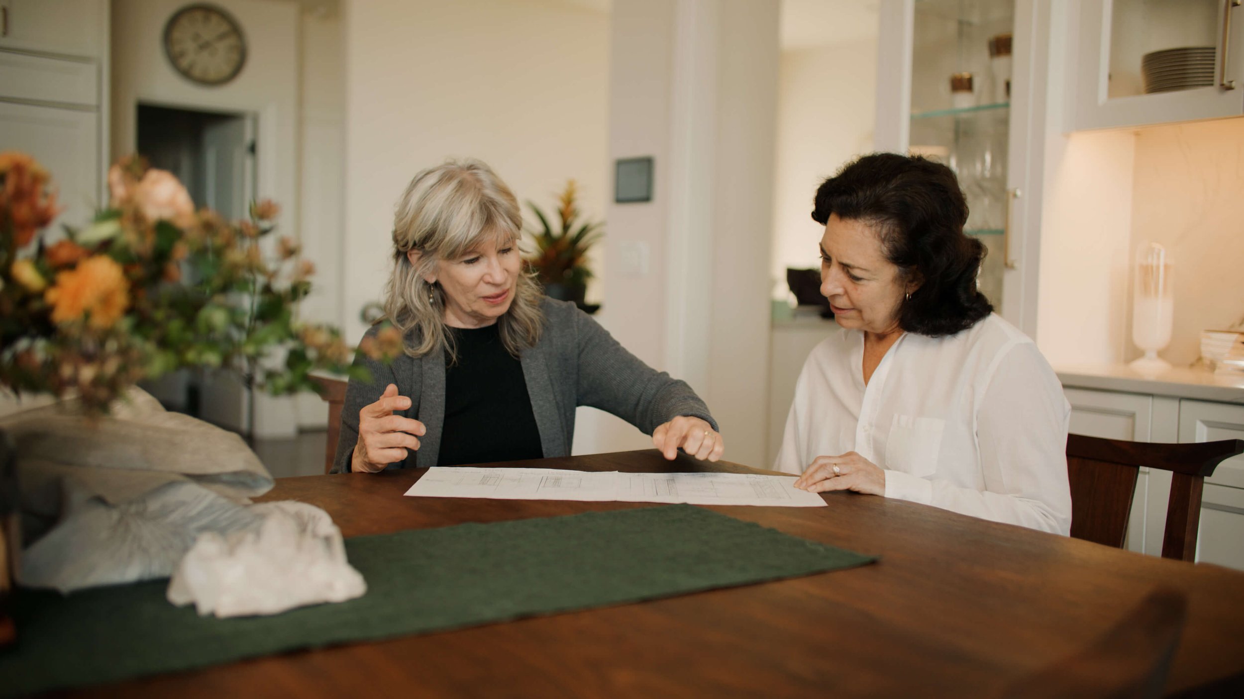
I was thrilled when Joanna called us to assist with a new remodel project by Colleen Mihalik Designs. I’ve known Joanna for twelve years now and originally helped with custom window coverings for her main bedroom and bathroom. Collaborating with her is always a fun and rewarding experience.
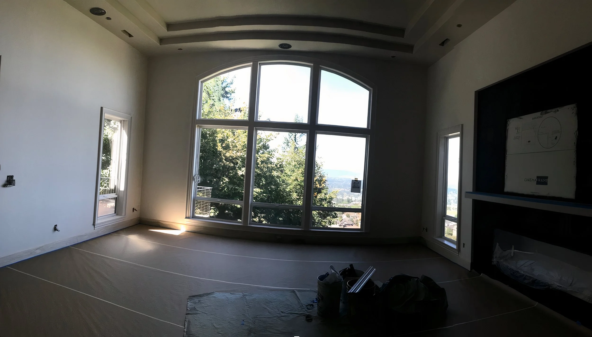
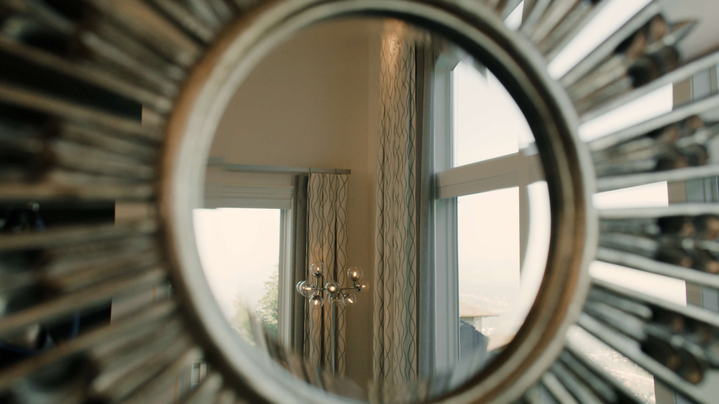
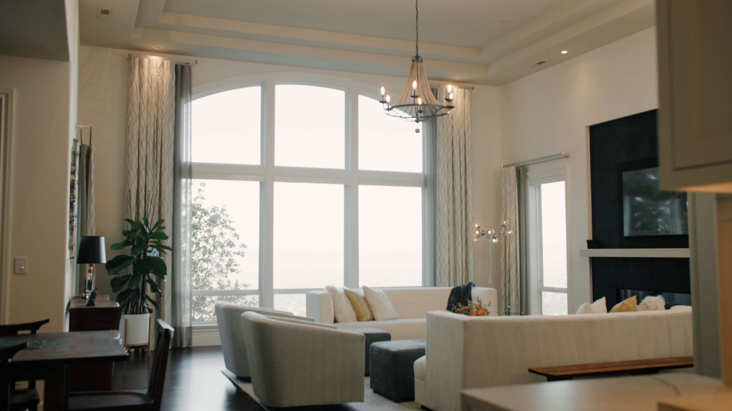
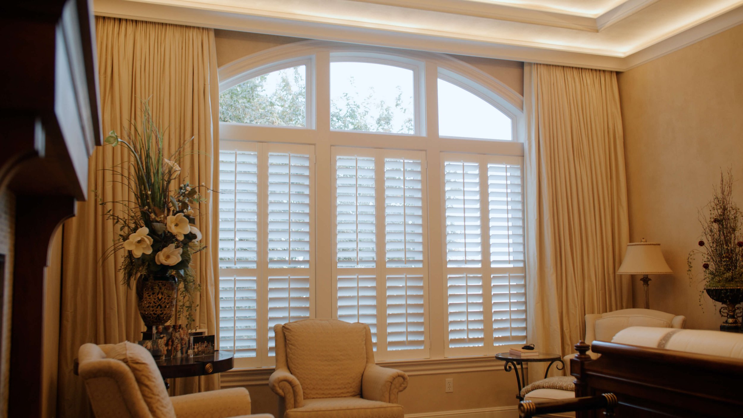
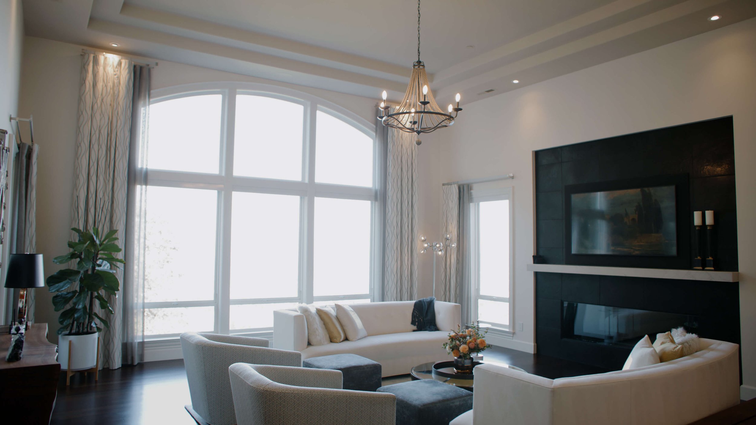
Though we were working on several rooms in the house, one stood out - the living room with its dramatic windows and stunning view looking out over Portland from a distance.
Joanna wanted to soften the look of the windows and add warmth to the room – without losing any of the view.
Other Challenges Which Had to Be Considered
Most window treatment designs start with a clear objective like preserving a view, but there are usually other secondary problems to be solved as well. A good design addresses both the aesthetic and practical concerns of a home.
The first practical concern was acoustic. The living room had hardwood floors, lots of glass, and very tall ceilings. Fabric was needed to absorb sound.
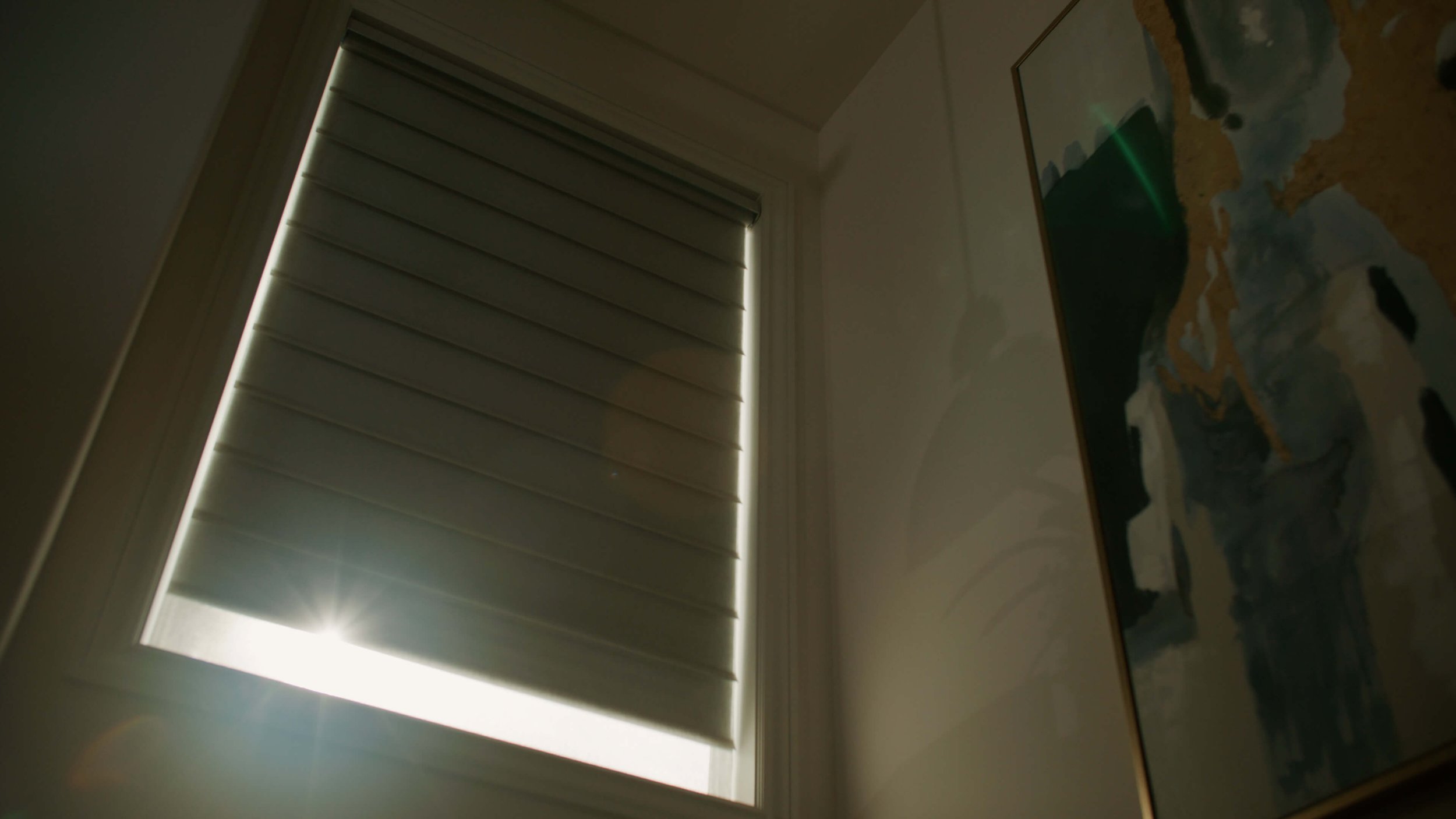
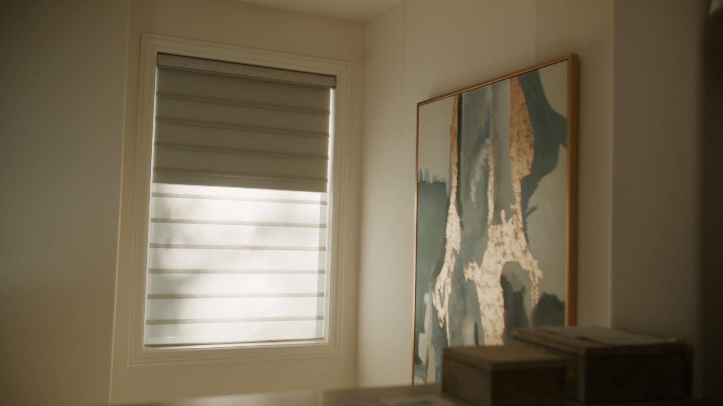
The second concern was the sun. The view faced west/northwest, and if left uncontrolled, the afternoon sun would pour in, make people uncomfortable, and cause furnishings to fade.
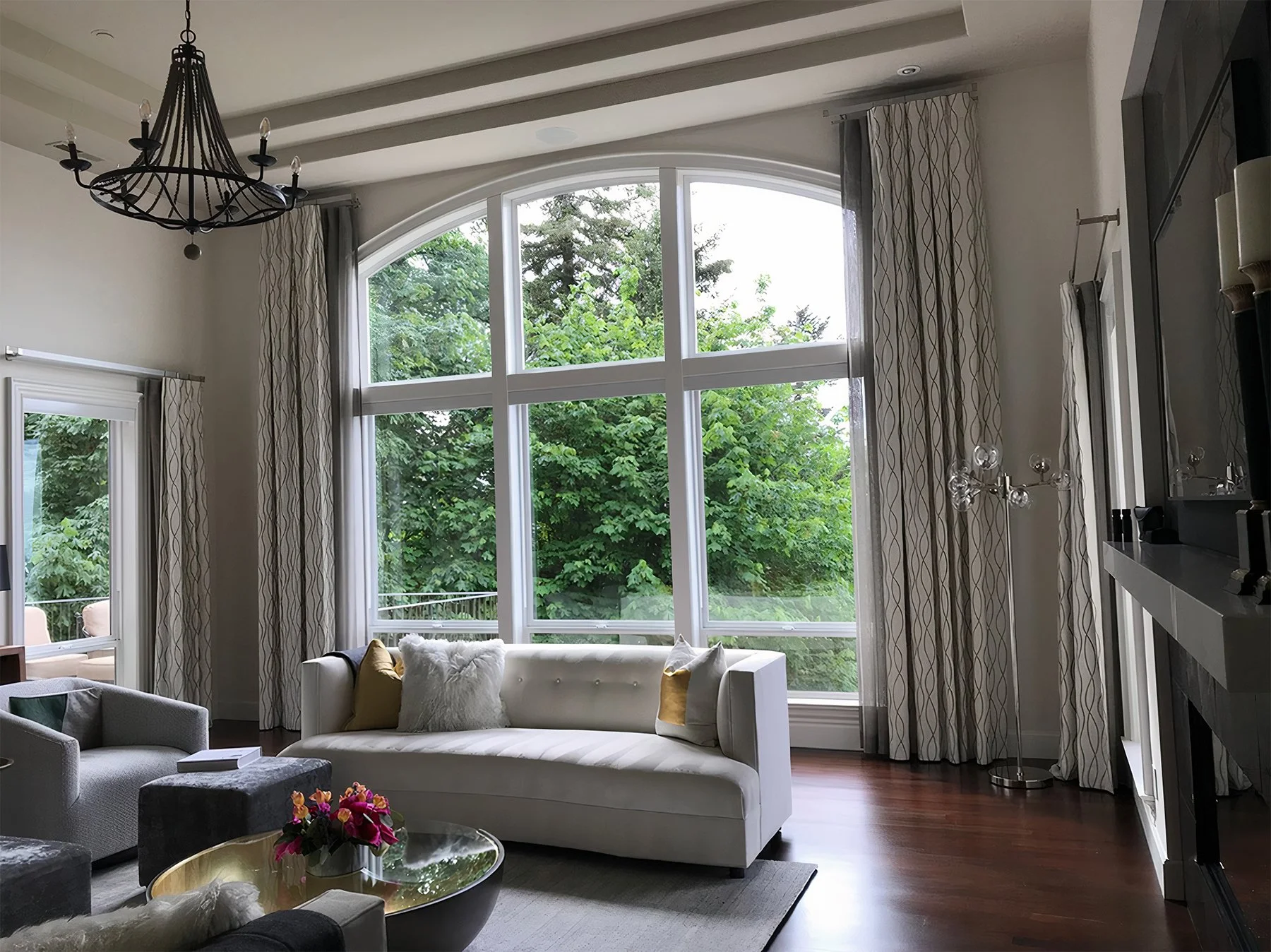
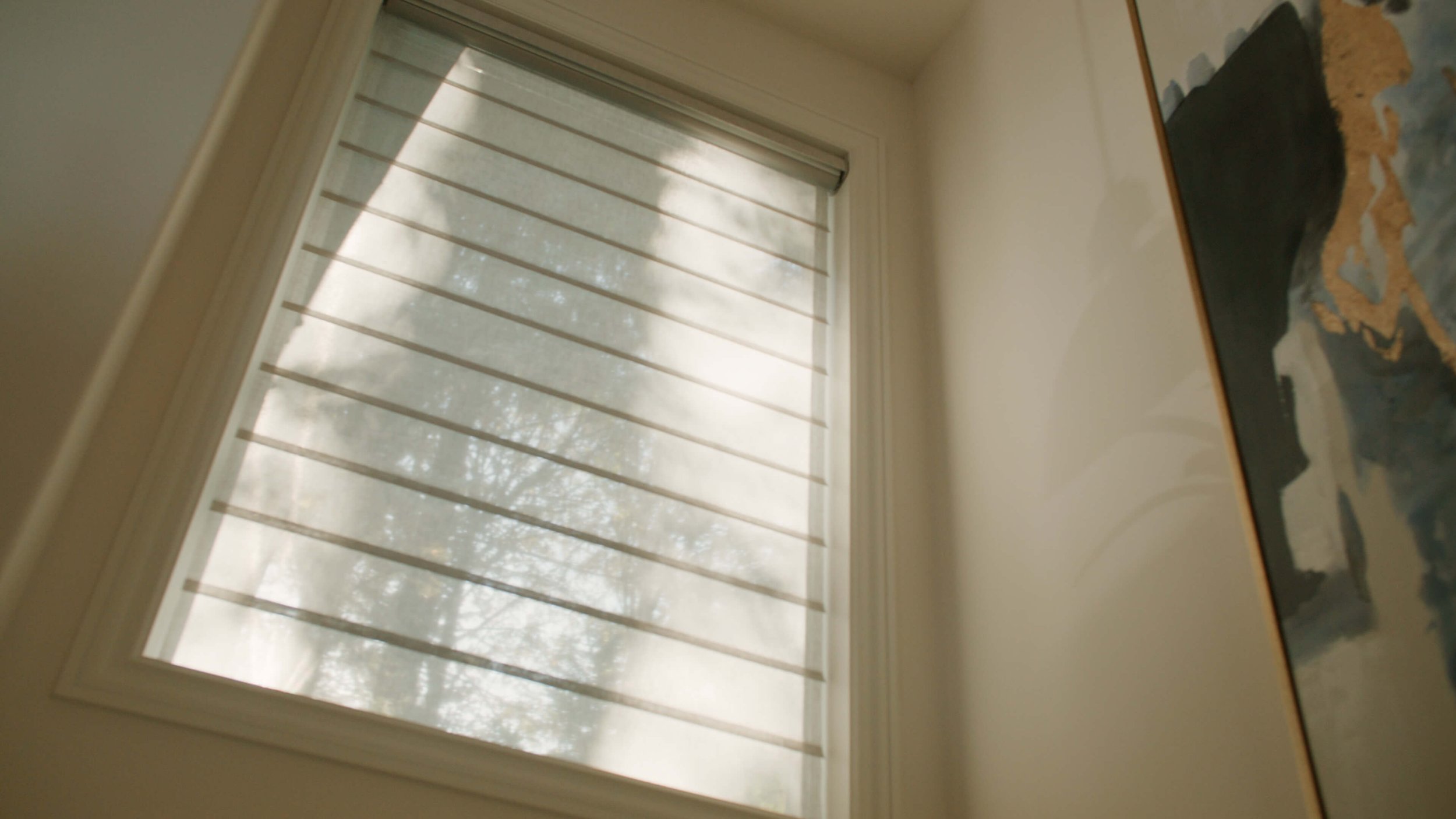
Fortunately, Joanna had already installed motorized sunscreen shades. This was good news for the design! With that practical problem solved, we could focus solely on aesthetics. We decided to frame Joanna’s windows with drapery panels that would add to the inspiration of the view rather than detract from it. The acoustic concern would take care of itself once the custom draperies were hung.
The Power of Illusion in Custom Window Treatment Design
With the sunshades in place, there was no need to create draperies that would draw all the way across the windows.
Since we didn’t want to cover the entire wall, we decided on a panel size that was appropriate in proportion to this large set of windows. These stationary side panels would look as if they were meant to close, but they would extend beyond the window frame onto the wall and not cover any of the view.
Further, to give the illusion of an inner layer of draw sheers, we added a sheer that peeked out from behind the drapery side panels.
Choosing Colors, Fabrics, and Hardware
With the basic configuration resolved, we could turn to the fun part – fabrics and hardware!
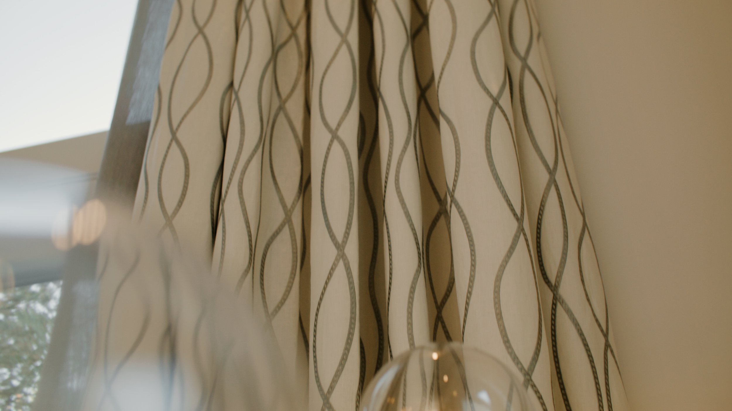
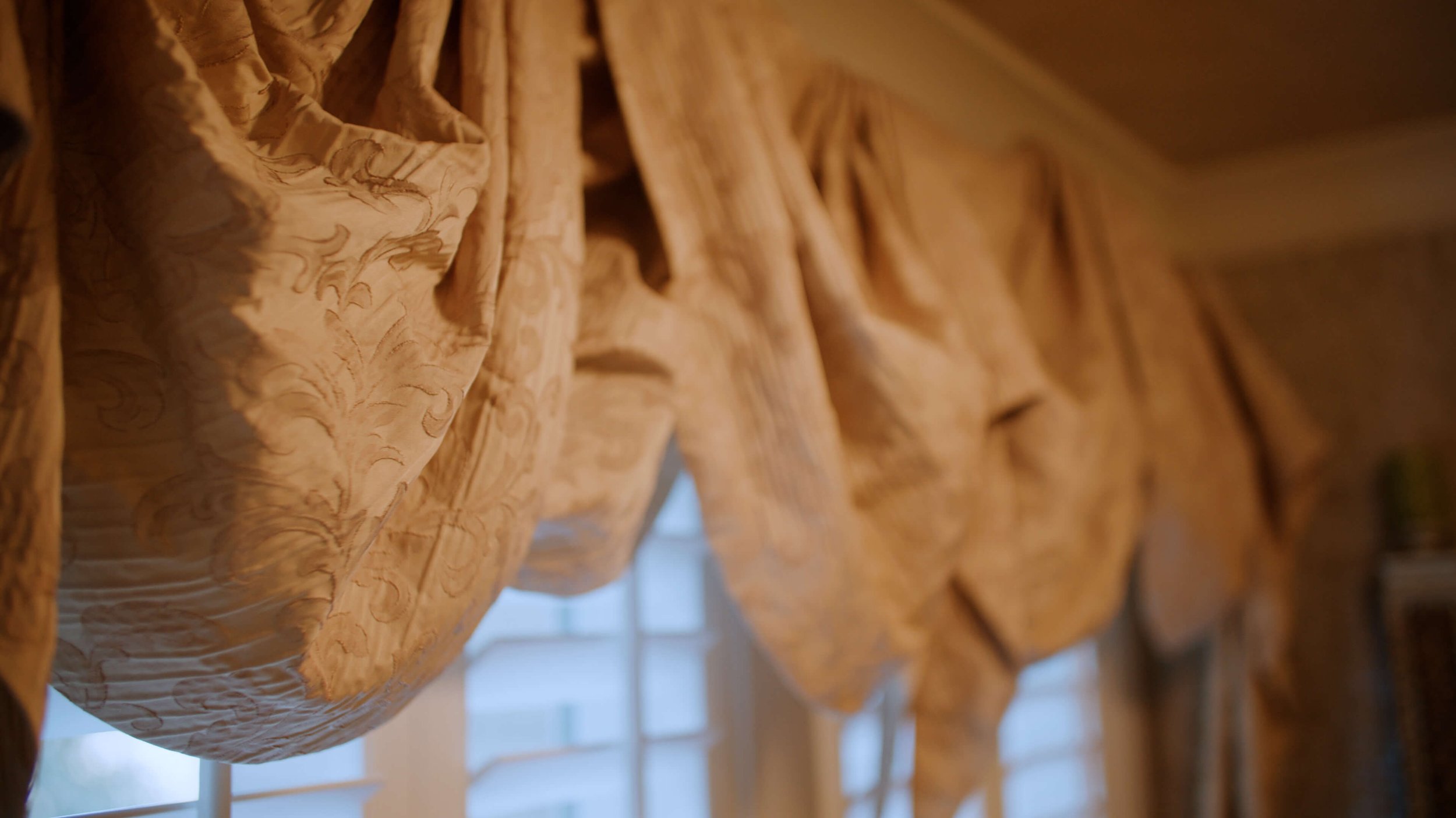
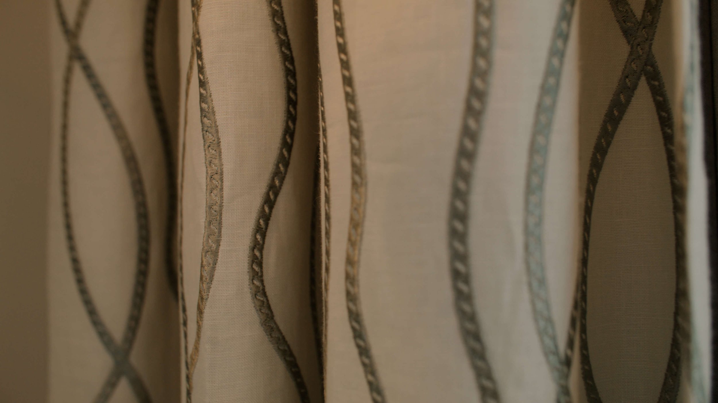
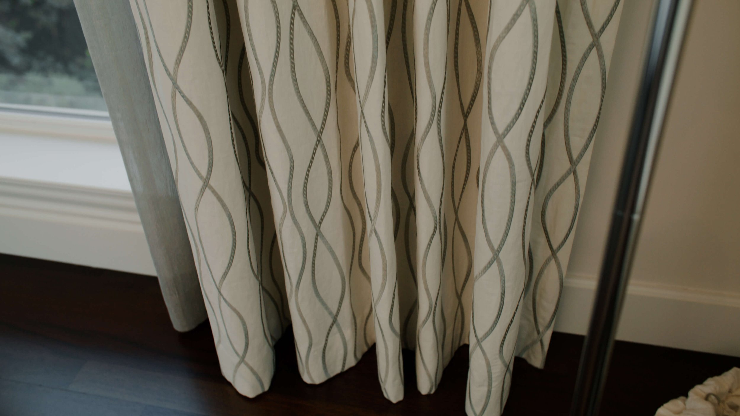
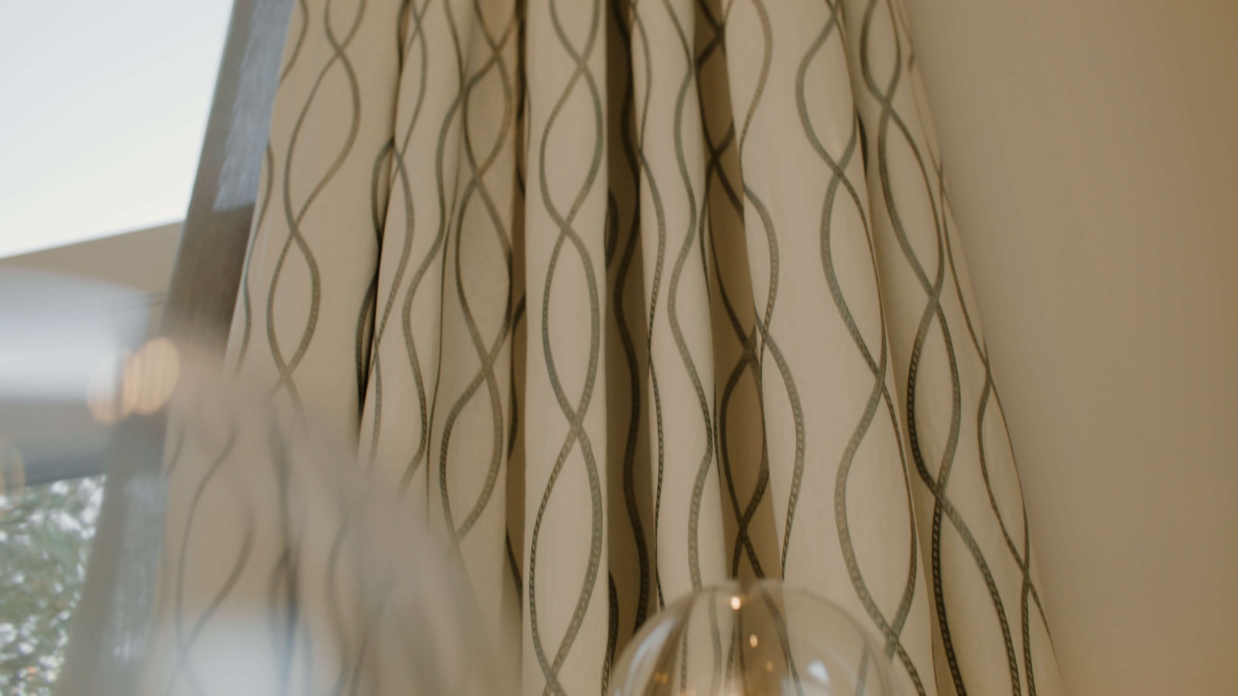
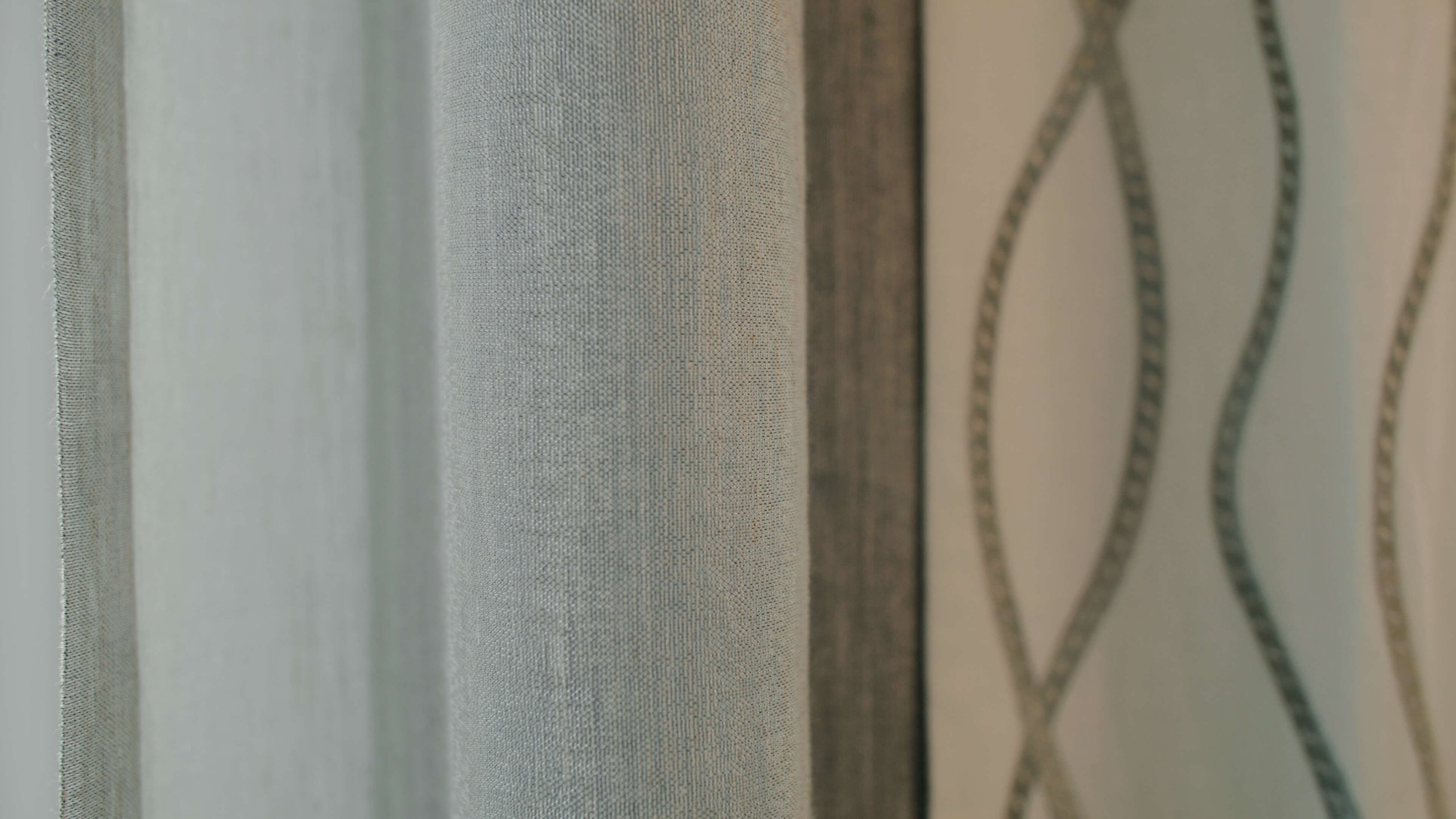
Joanna’s new color scheme was in tones of grays and creams, and I found the perfect fabric for the main drapery - a contemporary, flowing embroidered pattern in gray on a white linen ground from Kravet.
The peek-a-boo sheers behind the main drapery panels were a Kravet metallic in silver tones.
Joanna liked the simplicity of a Ripplefold look for the header of both the draperies and the sheers. Meanwhile, she had fallen in love with a spectacular hardware collection from Brimar which featured super-clean lines, a brushed nickel finish, and acrylic finials.
The only problem this created was that the Brimar collection used rings instead of the track configuration normally used to create the Ripplefold look.
This kind of thing happens quite often. Creative vision runs up against practical constraints, but most of the time there’s a way around them. Often, the constraints lead to even better solutions.
So, we discussed options and decided on an inverted pleat for both the sheer and drapery because of the hardware. I promised Joanna that we could achieve the Ripplefold look since the living room panels would always be in a stationary position.
Nearby, there were several other windows and features which needed to integrate with the design of the grand windows.
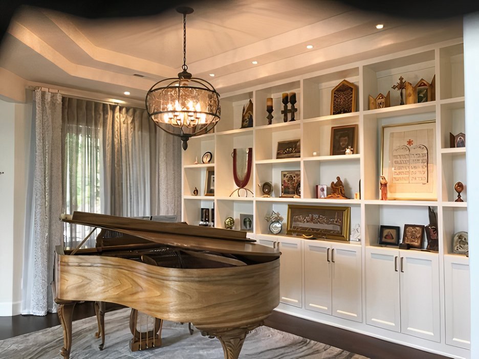
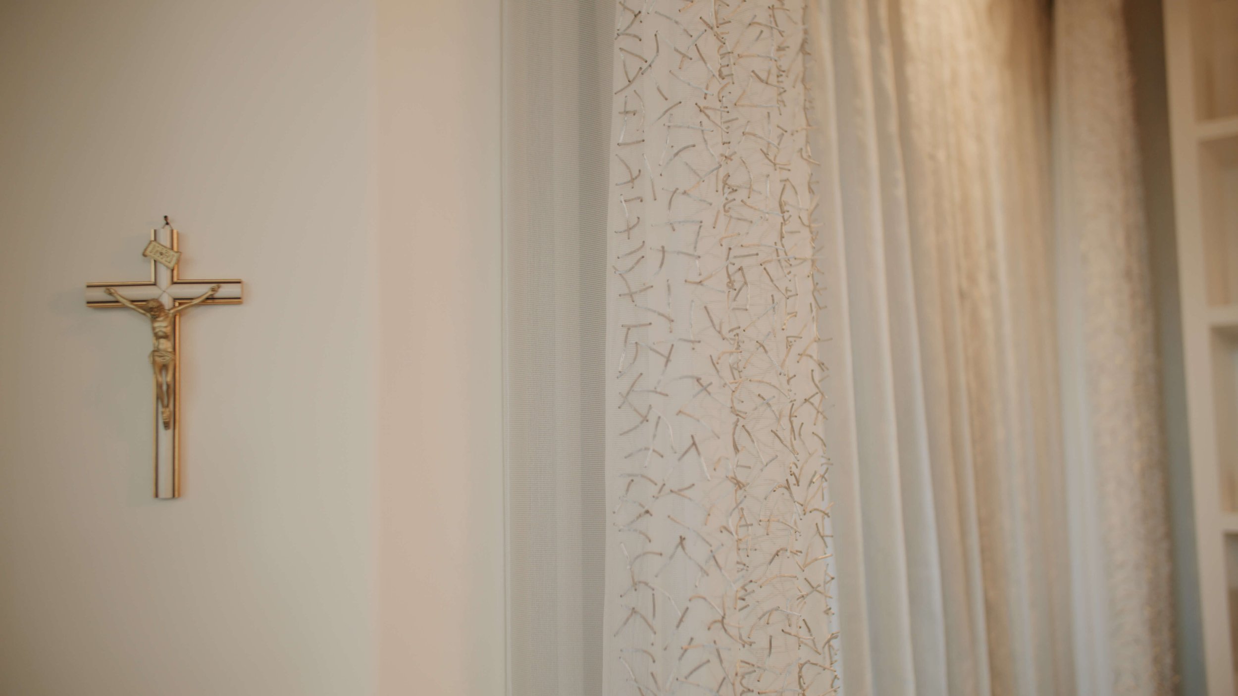
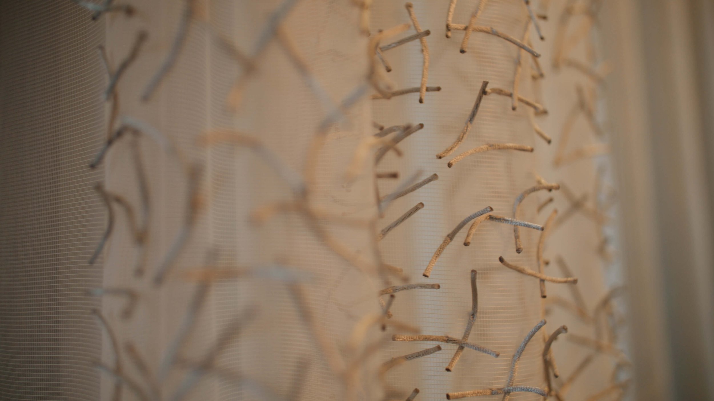
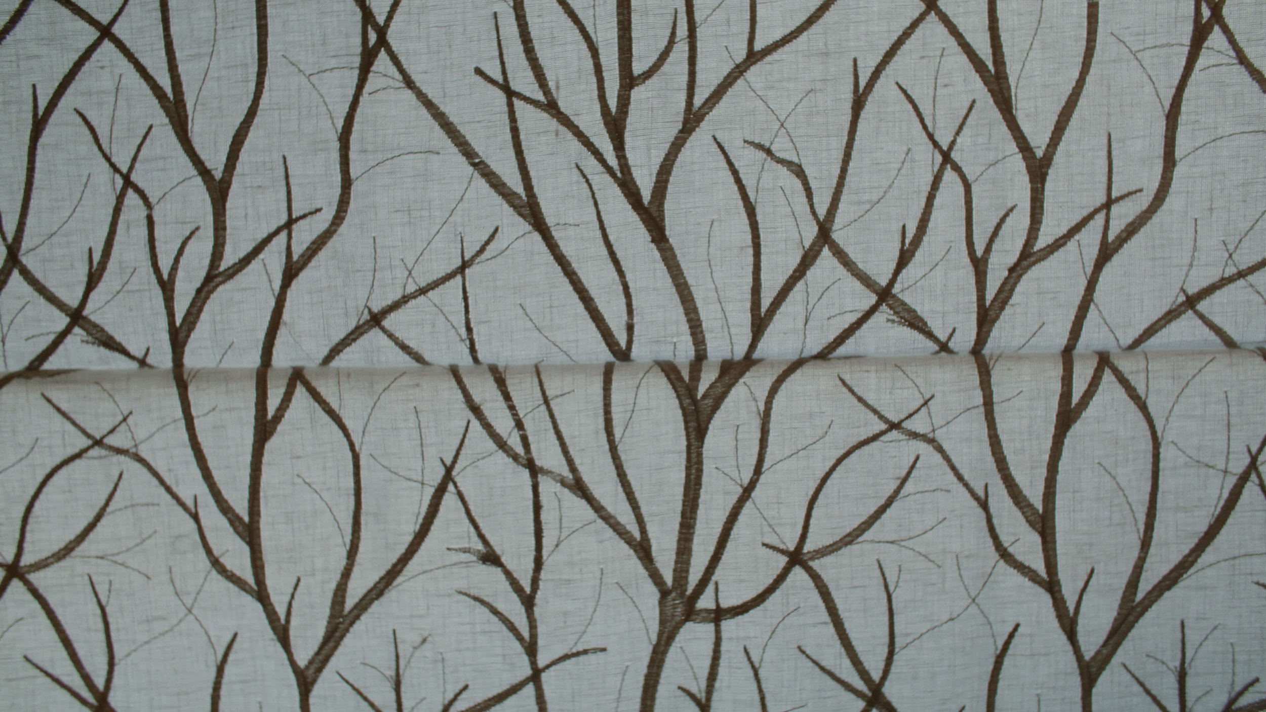
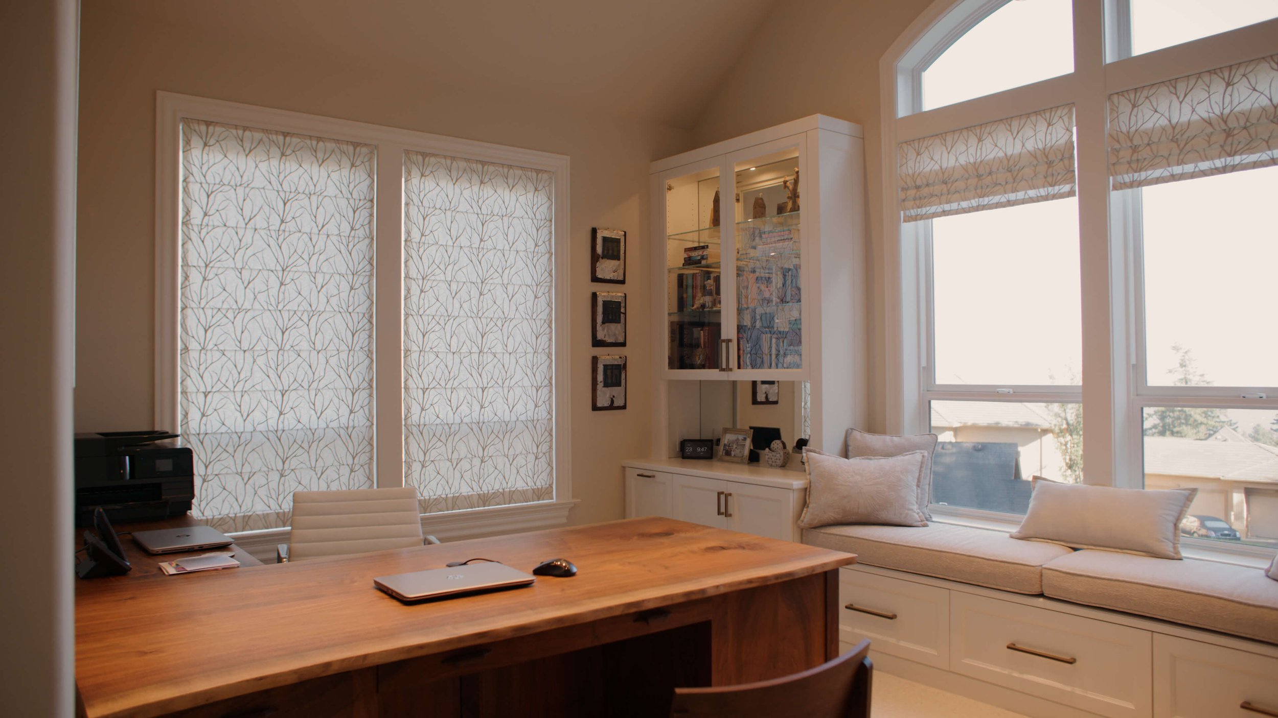
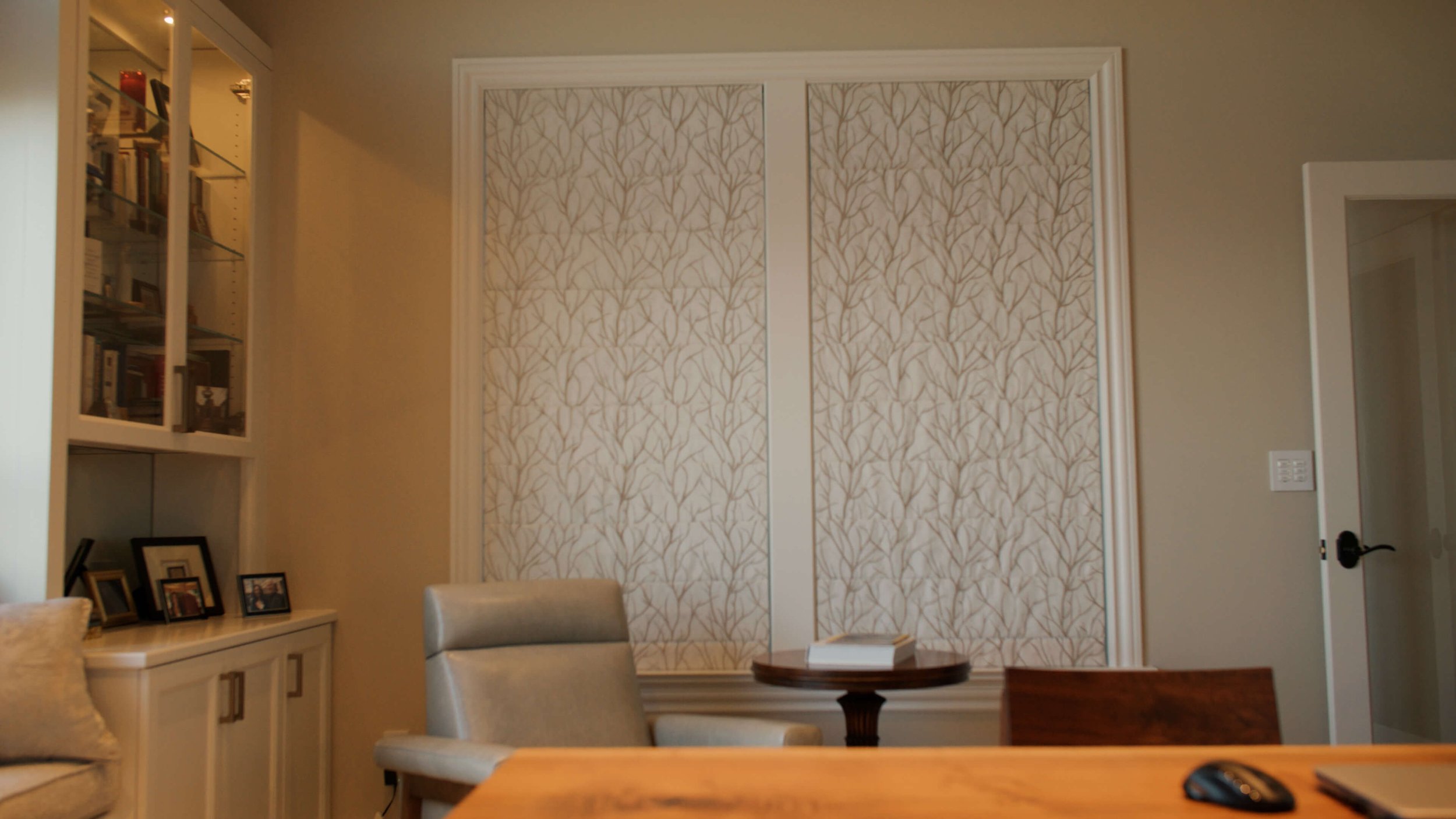
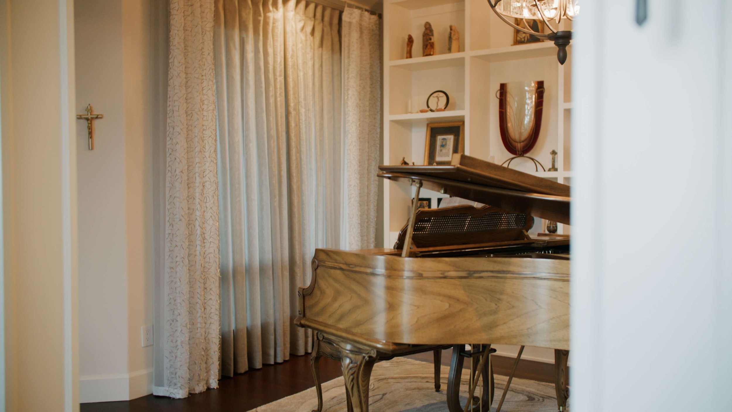
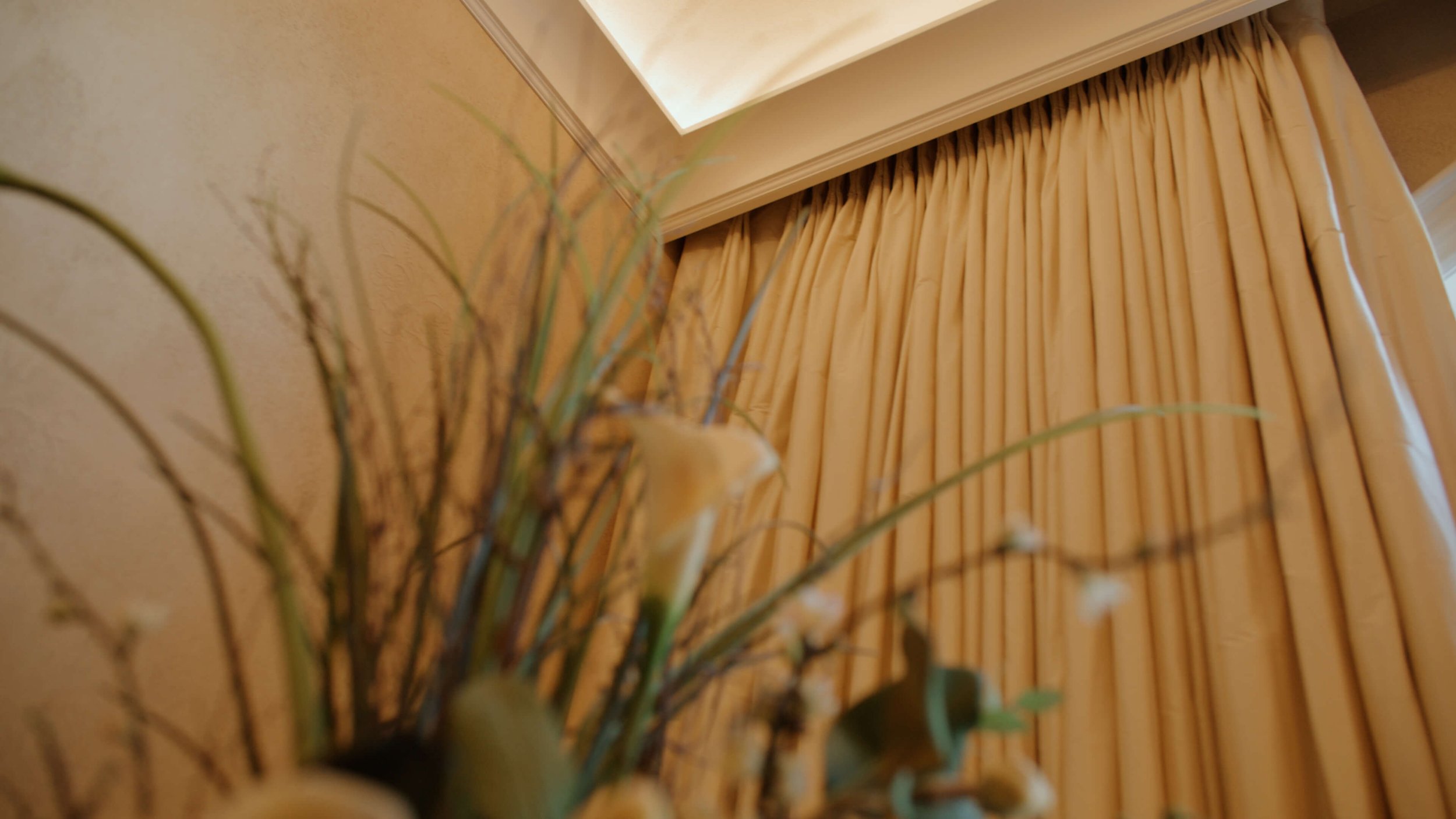
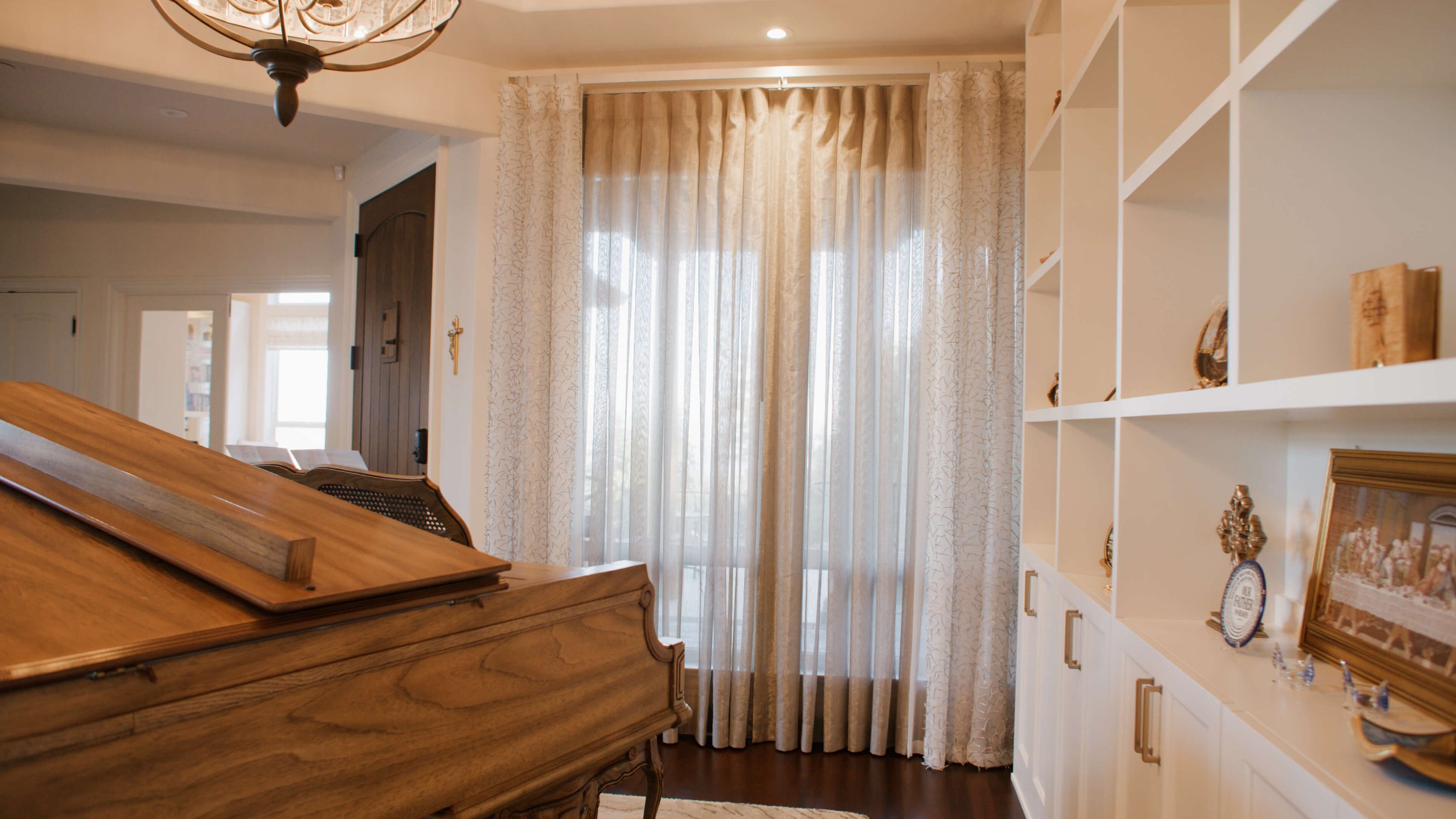
For example, the previous dining room was now being turned into an open study/music room. I knew Joanna appreciated unique and beautiful fabrics, so I showed her something a bit edgy. I found a fun sheer fabric called “Pick-Up-Sticks” which she loved, and we chose it as the main fabric in this area. Behind it, we added full draw sheers with inverted pleating to tie both open areas together. Special tacking behind the pleats allows Joanna to open and close the sheers.
The Endgame of Great Custom Window Treatment Design
As you can see in the video, the project covered many areas of the house, and we had one goal: to bring Joanna’s vision and style to life. She told us she’d never seen anything like it anywhere else, and that’s exactly the idea. It is uniquely her.
Our other main goal throughout our design process is to make it a fun experience for the client! Joanna enjoyed the creative journey while we handled the details in the background. That’s exactly how it should be.
Now, when she looks out her large, feature windows, she finds both joy in the spectacular view of the city and pride that it’s framed by her own creative vision.


